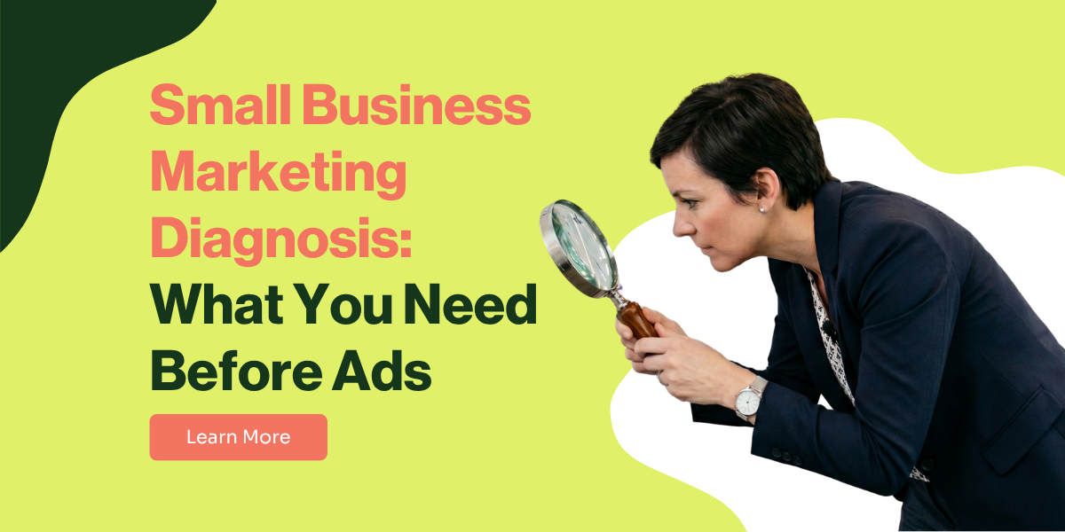
As part of our work as a healthcare marketing agency, we look at dozens of websites for healthcare and wellness practices every single month. We see what’s working, what’s failing, and what’s costing owners money without them even realizing it.
And a surprising truth has emerged: most practice websites, even the ones that look professionally designed, are silently sabotaging their own growth.
They’re not just underperforming; they are actively sending ideal, high-value patients directly to the competition. This isn't a rare problem, it seems to be the norm. And it usually comes down to the same four critical, yet easily fixable, mistakes.
Your Website Isn't a Brochure—It's Your Hardest-Working Employee
Most practice owners treat their website like a digital brochure.
As long as it has a logo and a phone number, they check the box and move on. This is one of the most expensive mistakes in healthcare marketing.
This problem is especially common for practices that use the "free" website builder bundled with their EMR or EHR software. While convenient, these template-based sites are often rigid and lack the proper structure Google needs to understand what you do.
Even though they are "healthcare-specific," they aren't built for effective marketing, leaving your content invisible to search engines.
Your website is your 24/7 gatekeeper. It’s the first impression, the lead qualifier, and the appointment setter, all rolled into one. The battle for a new patient is won or lost on four critical pages, and most websites are losing that battle before it even begins.
Here’s where it’s going wrong.
1. Your Homepage Fails the 3-Second Test
When a potential patient lands on your homepage, they have one subconscious question: "Am I in the right place to solve my specific problem?"
You have three seconds to give them a confident "yes."
If your headline is vague ("Welcome to Our Practice"), you've already lost. They'll hit the "back" button and click the next result on Google. Here's what your homepage must have:
- A Clear Headline (H1): States what you do and for whom (e.g., "Hormone Replacement Therapy for Men in Miami").
- Core Services Overview: A snapshot of your main offerings.
- Your Unique Approach: A short section on what makes you different. Why should they go with you vs other providers?
- Social Proof: Testimonials to build immediate trust.
- Clear Call-to-Action (CTA): A button telling them exactly what to do next.
2. Your Services Pages Are Invisible to Google
Let's say a patient is specifically looking for "TRT in Miami." They will never find you if "Testosterone Replacement Therapy" is just one bullet point on a single, generic "Our Services" page. This is a massive mistake in any healthcare marketing strategy.
A high-performing website has a dedicated page for each core service. This is non-negotiable for Local SEO, as it’s how Google understands that you are an expert in that specific area, making you a top candidate for search and map results. Here's what each service page must have:
- Service-Specific Headline (H1): e.g., "TRT for Men in Miami."
- Who It's For: Describe the ideal patient and the problems this service solves.
- Benefits & Outcomes: Focus on the results, not just the features.
- FAQ Section: Answer common questions to reduce hesitation.
- Service-Specific CTA: A button to book a consultation for that service.
3. Your About Page Is About You (And That's the Problem)
Most "About Us" pages are a history lesson about the founder. While that's nice, it fails to answer the patient's real question: "Can I trust you?"
Your About Page isn't about you; it's about proving to the patient that you are the right guide for them.
If it’s just a resume, it’s a missed opportunity to build the trust required for someone to pick up the phone. Here's what your about page must have:
- Your Story & Vision: Explain why you started your practice.
- Meet the Team: Professional photos and bios for your providers.
- Your Approach to Care: Reiterate your unique philosophy.
- Trust-Building Testimonials: Reinforce confidence with patient stories.
4. Your Contact Page Is a Dead End
The final mistake is often the most costly. A potential patient is ready to book. They navigate to your contact page and find a clunky form or a hard-to-find phone number. This friction is fatal.
Just like your Services pages, a well-optimized Contact/Location page is crucial for local map searches. You need to make it incredibly easy for both Google and your patients to find you. What your Contact Page must have:
- Clear Headline & CTA: e.g., "Schedule Your Consultation Today."
- All Contact Details: Phone, address, and hours clearly visible.
- An Embedded Google Map: Allows for one-click directions.
- Simple Contact Form: Only ask for what you absolutely need.
It's Not a Design Flaw, It's a Strategy Flaw
If this sounds familiar, don't worry. The problem isn't your fault. These issues happen because of a flawed strategy—treating website design as a one-time task instead of the absolute foundation of your growth.
At Tobe, we call this the "leaky bucket" problem. And it's why our Grow Smarter Method is so relentlessly focused on building your Brand and Website before you spend a dime on ads.
If you suspect your website might have some of these leaks, we can help you find out for sure. You don't need a complete overhaul to see results; you just need a clear, expert opinion on what to fix first.
That's why we offer a Free Grow Smarter Assessment. It's a no-pressure, 30-minute call where one of our experts will personally review your website and your overall digital strategy. We'll diagnose any gaps, show you what your most impactful next steps should be, and give you a clear path forward. Stop guessing and grow with confidence!